
Are you looking for the perfect colours for your custom medals?
When it comes to designing a medal, colour plays a crucial role. The right colours can communicate your message, evoke emotions, and leave a lasting impression. But with so many options, how do you choose the perfect ones? That’s where we come in.
At MedalStudio, we’ve helped hundreds of businesses design medals that not only celebrate achievements, but also reflect their brand’s identity. We know how to choose a colour to make a long-lasting impression.
So, in this article, we’ll walk you through four essential steps to help you choose the right colours for your custom medal:
- Understand the meaning of colours
- Use a colour wheel
- Consider the event
- Visualize the design
Let’s get started!
#1 Understand the Meaning of Colours
When designing a custom medal, it is essential to consider that each colour evokes unique emotions and feelings. By selecting meaningful colours, you can ensure that the medal not only celebrates the recipient’s achievements but also becomes an unforgettable keepsake.
According to Mental Health America, colour theory suggests that colours have a psychological impact on people’s behaviours and emotions. This connection between colour and psychology has existed, in some form, since the time of ancient Egypt and is based on exposure to colours. For instance, being surrounded by vibrant colours can help boost energy and vitality.
With this in mind, it is crucial to reflect on the type of emotion you wish to convey through the medal’s colour. Below, we explore what each colour symbolises:
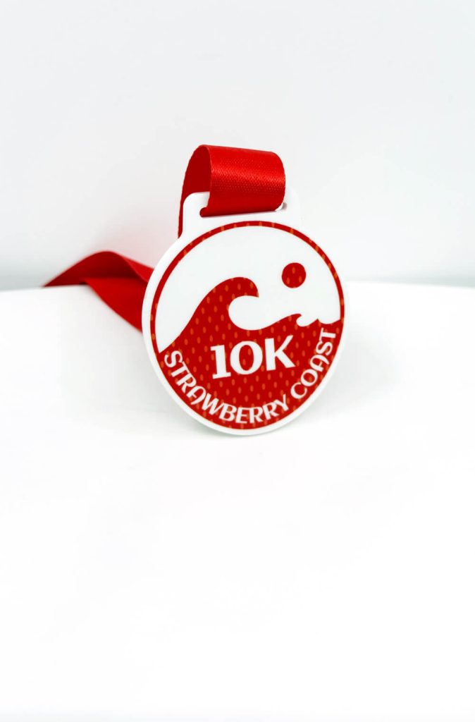
- Red: The shade of this colour can have a significant impact on the emotions it evokes. For instance, a bright red is often associated with passion and strength, whereas a darker tone may convey alertness, danger, or seriousness.
- Blue: This colour is commonly associated with tranquillity and serenity. It can also convey trust and inspire professionalism, making it an ideal choice for corporate settings. However, bear in mind that it can sometimes evoke different emotions, such as sadness.
- Orange: This vibrant colour is often linked to creativity and activity. It can inspire feelings of enthusiasm and is frequently used in tech contexts. Orange would be particularly appropriate for sports medals, such as those for basketball or cycling.
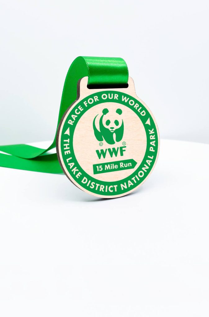
- Green: The colour green is often associated with nature and harmony. Mental Health America suggests that it promotes independence and inspires change, making it an excellent choice for medals, especially if your brand is related to sustainability, health, personal growth, or environmental awareness.
- Purple: This colour is often perceived as mysterious and elegant. Historically, it has been linked to royalty, nobility, and luxury. Therefore, we suggest using purple for honorary or ceremonial medals. You could also pair purple with complementary colours, such as gold, to create depth and elegance.
- Pink: This colour is often associated with kindness, romance, care, and compassion. Adobe suggests that an intense hot pink conveys urgency and playfulness. We recommend using this colour for recognition medals in areas such as community service and caregiving.
- Black: This colour often symbolises sophistication and elegance. Many brands use it to represent power and evoke intrigue, making it perfect for corporate awards and memorial medals. According to Adobe, a bold splash of black tells your story like no other colour can, so keep this in mind when considering adding an edge to your design.
#2 Use a Colour Wheel
One of the easiest ways to choose the right colours for your custom medals is to use a colour wheel.
The colour wheel can help us define colours and understand how they interact with each other. This way, we can choose combinations that look good or make designs more visually appealing.
The colour wheel has the primary, secundary, and tertiary colours arranged in a circle to understand how they can be mixed or matched.
Here’s how to use the colour wheel:
- Choose your base colour and explore complementary colours: Once you’ve chosen the primary colour for your bespoke medal, draw an imaginary line across the colour wheel to find its complementary colour. Complementary colours create maximum contrast when placed together, making both colours appear more vibrant.
- Consider analogous colours for harmony: If you prefer a more harmonious and subtle colour scheme for your medals, select one colour and the two colours adjacent to it on either side of the colour wheel.

- Use triadic colours for balance and vibrancy: Triadic colours consist of three colours that are equally spaced around the colour wheel in a triangular pattern. This colour scheme is ideal when you want a vibrant yet balanced design, making it perfect for playful and creative themes.
If you’d like additional help in selecting the perfect colour combinations, we recommend using an online colour wheel tool like this one. Using these types of tools makes it easier to visualise complementary, analogous, and triadic colour schemes, helping you choose the options that best suit the look and feel of your medal.
#3 Consider the Event
When selecting colours for your custom medal, it’s crucial to consider the nature of the event, as it sets the tone for the design.
Choosing the right colours will ensure they resonate with the occasion and the participants. For example, a corporate event might call for professional hues such as navy blue or black. On the other hand, if the event is for children, bright colours such as orange and yellow might be more appropiate.

Events centered on specific causes can also inspire you color choices. For instance, a breast cancer awareness event often incorporates pink. By using this colour in the medal design, you can foster a sense of solidarity.
If you’re hosting an event, it’s also important to think about branding. We recommend including your logo or brand within the medal. This way, the recipients can always remember your brand in a special way.
#4 Visualize the Design
Once you’ve chosen the right colours for your custom medal, we recommend creating mock-ups to see how they work together.
Start by experimenting with different colours and designs, creating new combinations until you are satisfied with the final result. Sometimes, subtle changes can make a significant difference, transforming the entire look and feel of the medal.
However, if you don’t feel confident doing this yourself, don’t worry! At MedalStudio, you can share your ideas and preferences regarding colours and design. We offer a free design service, where we create a visual representation based on the images or logos you provide.
Designing Memorable Medals
Understanding the psychological impact of colours, using tools like the colour wheel, and considering the nature of the event, you can create a medal that not only celebrates achievements but also reflects the intended message and emotion.
If you have any questions regarding our custom medals and free design service, please do not hesitate to email us at [email protected] or call us at 01377250449.
Updated: 10/01/2025